 |
| My photography example |
Genres -
 |
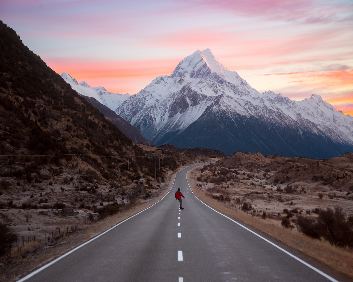
| Brandon Woelfel example |
The photographer may have wanted to blur the background to create the aesthetically Bokeh effect, possibly to represent the busy city life. The busy life concept interrupted by the main subject of the model, this being the main subject due to the foreground in focus. The photograph is composed in a visually pleasing way with the rule of symmetry. Learning about the various genres within photography such as editorial, portrait, landscape, fashion etc. has provided me with extensive ideas for future projects.
Research & photographers -
 |
| Karl Shakur photography - Opposite to Jim Zuckerman's size rule |
 |
| My photography example |
Practising the process of photography, under the genre chosen such as fashion or portrait, or street and landscape with the inspired research over the year has included various locations, this being out in central London or the photography studio. Within the studio, we have learnt various setups -
Three point lighting, high-key photography, low-key photography-
The traditional photography studio setup including the key / main light, giving the subject the most strength in light and can be used for contrasting photos, in the example that the other light, the fill light, is off or low. This can gives results of a rendered shadow across a models face, for example, a practical in which we learnt this technique alongside low-key photography (example)
 |
| Photograph taken when learning about Low-key photography |
The fill light, placed opposite to the key light, is used to 'fill' shadows created by the contrasting key light. The key light may be brightest with this slightly dimmer, however throughout the year experimenting with practical tasks, I had experimented with adjusting the 1-6 dial settings. Lastly, the back light positioned down to view the main subject. The back light does not provide direct lighting, rather subtle highlights for the outline of a subject e.g the models hair. The back light separates the model from the backdrop. Other aspects that separate the model from the backdrop in techniques such as high-key photography is the poly boards and un-diffused lights, lights with no soft boxes around them, that reflect to the backdrop. In terms of high-key lighting, the backdrop turns completely white, infinity lighting therefore making the main focus the model. Practising this technique in the studio included advantages such as understanding the setup and ability to set the lights in the same composition, however challenges included the camera settings, adjusting and being knowledgeable when adjusting the ISO, along with how much light to let into the lens as part of aperture. To improve and expand my knowledge within photography, I would like to experiment more with technically adjusting the camera under high and low-key photography settings, though I feel confident in understanding the actual setup.
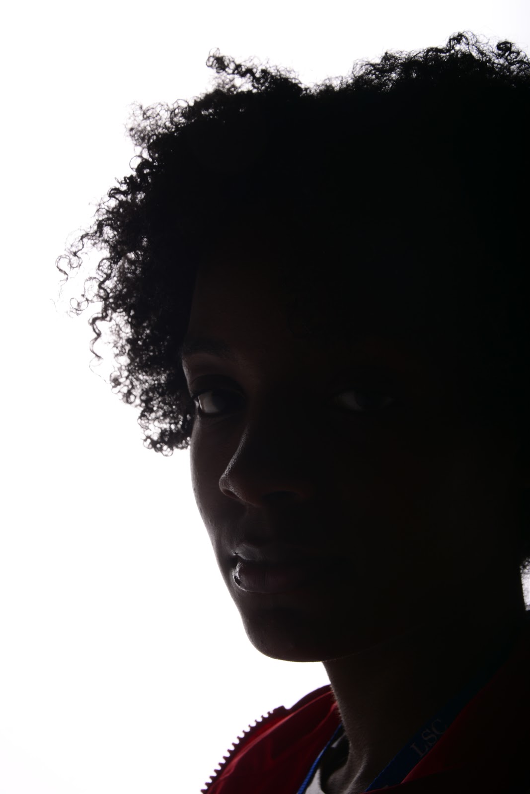
Silhouette lighting-

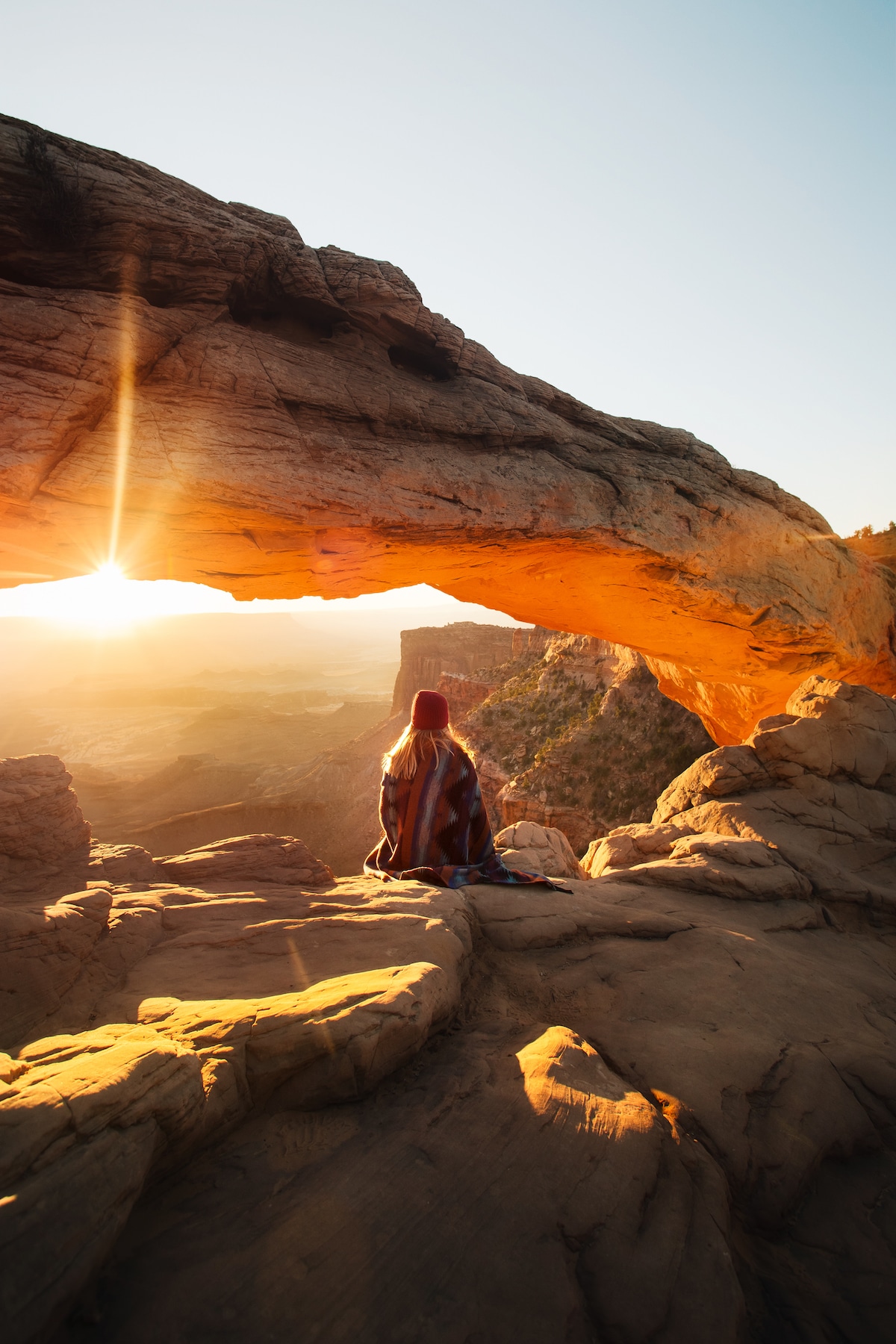
Projection photography -
 |
| Projection photography |
Technical camera operation -
Initially beginning the year, I was unaware of the main elements in regards to photographing, this including the technical settings cameras have giving the end product of the photograph and affecting the aesthetically qualities of it. These including:
Aperture and F stops. Gathering the information of F stops - the higher the F stop the less light therefore smaller aperture and a higher f stop also meaning light only travelling in one direction, therefore creating depth of field and opposite to this, a wider lens allowing light to travel in every direction therefore meaning a blurred background, creating shallow depth of field was challenging to understand initially, however became more clear when practising with Nikon cameras. The concept of shallow depth of field created through the camera settings has helped me tell meanings behind photos, such as - (example) The F stop being between around 1.8 to 8 allows a large amount of light into the lens allowing the background to be adjusted and blurred, creating a purple bokeh effect. The concept including the idea of colour and size,though there are many blue/purple lights in the background, they're smaller and are under the bigger yellow/ orange bulb. The yellow possibly being brighter than the other lights period, or just the composition and idea of size making it look visually more important. The depth of field created through the cameras settings can therefore overall impact a photos intention. Learning about this from the beginning intrigued me, and further does as I would want to know what camera settings are used in order to create some style or sense of emotion, depending on the way in which the brightness may be or movement in the image.
 |
| My photography |
ISO
Learning about the cameras sensitivity to light was less challenging than aperture and F stops, and further striked ambitions of personal style. A lower ISO is what I typically would use as developed throughout the year, e.g in the example. Practical tasks focused on using
ISO had been undertaken more on location than when using the photography studio, personally needing practise with adjusting the ISO in high-key and low-key photography studio lighting setups, this being a goal I have set for future photography studio practise sessions. Research I had conducted midway through the year in terms of ISO included the underexposed and overexposed noise/grain element. The idea that a higher ISO meaning a more noisy, brighter photo, possibly labelled as overexposed and a lower ISO, a darker photograph being underexposed. Overexposed and underexposed hold intriguing creative messages, viewing and connotating settings certain photographers may have used and reasons behind this- e.g for the aesthetical quality.
 |
| My photography grain example |
Shutter speed
Alongside learning about aperture, I also learnt about shutter speed initially. The process in which controls how fast or slow light travels through the lens. Techniques experimented with shutter speeds that I have attempted on location include the blurriness of photos, however have not experimented with capturing fast movement. I also have aims of exploring more themes such as long exposure photography as further development from the year with a fast shutter speed, an example of a photographer specialising in this being Andrew Stawarz.
Adjusting the fractional shutter speeds can be important in situations such as capturing a single frame when a lot of movement, actions taken to capture the photograph making the image more powerful. I personally find shutter speeds challenging to understand out of the three main elements however researching and practising further will improve skills I hold.
Using a Nikon:
 |
| Vertical composition |
through practising in the studio and playing around with settings
including zooming and focusing when appropriate along with adapting to the difference between using manual and auto mode, however more challenging elements where improvement is needed in terms of locating shutter speeds and white balance. Smaller features I learnt included shooting in portrait, vertically.
Creative intentions - Final project
Concluding my final project, the process of planning went well as I was able to identify photographers I enjoy viewing and able to apply their work to my creative intention, including messages of human elements vs nature and how this can be subtly done through capturing contrasting subjects. This being both metaphorically through my reasoning behind things like a human eye compared to brighter lights and the darkness of the human aspect compared to the more vibrant side. This carried out in other brighter light settings of my collection, the two images taken at golden hour sunset time. As planned, I wanted to use this time of day to make the photographs cinematically
pleasing and give a golden, sunset glow. The arm behind one of the photographs links to Connor Frantas photography, this being an inspiration and including
an element of a human that isn't fully in frame. I have chosen the collection of 4 images, 2 taken horizontally and 2 taken vertically as I feel the layout will fit together. The 4 images are split into coupled pairs, the photos that have the similar lighting together. Learning the functions of a Nikon camera have improved, however I personally feel more practice is needed for Nikon cameras and I am confident with Canons. Using more techniques confidently such as rule of thirds and framing will occur in future projects as reflected off this project. The overall end product and lead up to do so has made me enjoy photography more, and given more contextual knowledge in terms of research and wider photographers / photography genres.
Post Photoshop editing -
Learning in Adobe Photoshop initially had been challenging and I feel as though I still need practise within the software. Minor edits have been made in my final collection, for example the sharpen tool for extra details of the lensball and photography adjustments, such as higher vibrance and lower brightness.


